One thing I miss in iOS, which Android has, is auto expanding labels (and other views). Android has the wrap_content layout option, which works really well to flow a view.
<LinearLayout
    android:layout_width="match_parent"
    android:layout_height="wrap_content"
    android:orientation="horizontal">

    <TextView
        android:layout_width="wrap_content"
        android:layout_height="wrap_content"
        android:text="@string/currency_symbol"
        android:textAppearance="@style/TextAppearance.AppCompat.Large"
        android:textColor="@android:color/darker_gray"/>
iOS was lacking that - or so I thought. In the past, I'd had to use code to measure the size of a block of text, then set the frame and adjust other things.
var size = new NSString("Text here").StringSize(font, 9999, UILineBreakMode.CharacterWrap);
label.Frame = new CGRect(label.Frame.Origin, size);
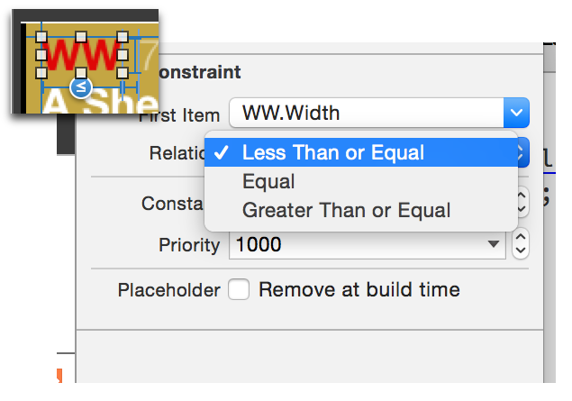
Autolayout changes things a bit. It's all declarative-y and designer-y, so I prefer to keep things like that inside the storyboard designer as much as possible. I recently learned how to do this, tho: the >= (or <=) constraint.

In this case, I want the stop identifier (WW) to resize based on it's content. It could be blank, or it could have one or 2 letters. I'm using the size of WW - about the maximum width - as the largest size, and allowing it to resize as needed. All the other constraints which are dependant on it flow from there.
The only constraint I need to manually adjust is the space between the WW and the following label ("7" in the image - "75m North West"), as I want to remove it - set it to zero - if the stop id is blank.
This works for vertical height too. Set it to be greater than or equal to the minimum height - usually one line of text, which is around 21 points - and set the number of lines to zero. The label will now take as much vertical space as needed.
This is not something which is obvious, at least it wasn't to me, but it solves one of the big blockers I had with both Autolayout, and iOS in general - dynamic layout, especially of text.