On Monday, Apple approved the latest version of mobileAgent - mobileAgent 2.0. As usual, it's available on the App Store
Version 2 isn't a full rewrite. It's a reworking and a bit of a rethinking of the same, nearly-3-year-old app, with a fresh coat of paint.

The only real new feature, outside of cleaning things up, is Bills - you can record a bill as it comes in, including recurring bills. There are a few smaller bits in there tho
- Expenses can now have a currency assigned, so you can log a USD expense into your GBP company
- Bank accounts, which are a lot more use with automated bank feeds, now show a full month as well as a sparkline-style graph showing the balance over the previous 3 months
- Invoicing has been cleaned up a lot, mostly visual, but also with the addition of being able to resend an invoice. This is useful if you are at a client site and they throw the "oh, we haven't received the invoice" line.
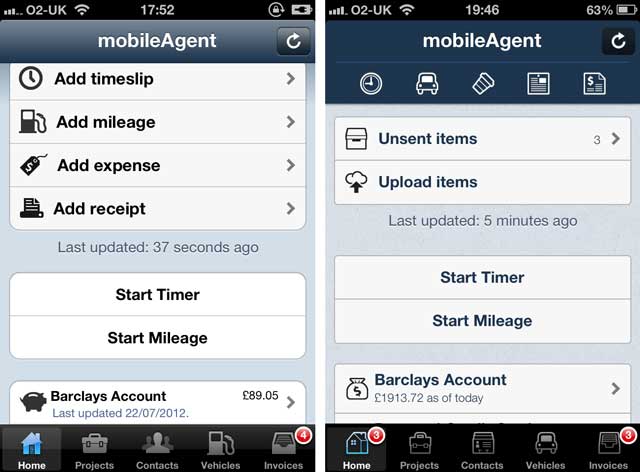
The main, and most visible, change is the whole UI. The old version used the default iOS theme, and it was looking very dated against any of the newer apps. It was a very quick and flexible way to write the app, but it was looking very, very dated.
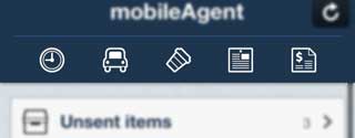
A major - and I hope, not confusing - change is in the main action buttons on the front page. They were taking up a lot of space without any real reason, and now they are in a nice row along the top:

(Thats timeslip, mileage, expense, bill and receipt)
As part of that, I revisited every screen, removing a few little used (and little known) features, and made everything consistent - same font (Helvetica Neue, which is also the one used eveywhere in iOS7), same colours, icons from the same set, same styles. Consistency was a #1 priority[1]. I have also comissioned a new icon, which I hope will look a lot better on your precious homescreen real estate.
![]()
After doing this, there is still one major area which the app doesn't do. I am planning on doing this (after putting it off for ages), tho it may be a small in-app purchase. Stay tuned - I'd rather not pre-announce it incase I don't get time to finish it before we head back to New Zealand!
For anyone wanting some more technical details on the update - theming, customising monotouch.dialog and the like, I have a few posts coming up on that.
While I started this rework a long time before iOS7 as announced, there are some similarities in the styling. Thats just a nice, happy co-incidence. About the only thing that was a direct reaction to iOS7 was the Nav Bar, which I removed some of the highlights from. Of course, if you were not on the beta, you wouldn't have seen this anyway. At present, the app works fine in iOS7. ↩︎