Leonie and I have decided to do something about the level of exercise we get. We are fairly active - we cycle to work most days, go to the gym a couple of times a week, walk a lot, that kind of thing - but overall, something isn't working.
We are starting out with the "measure everything so it can be changed" route, using the scales we have, and grabbing a pedometer to measure both walking / activity and sleep.
I'd heard good things about the Fitbit Flex, and Leonie wanted to try the Jawbone Up, as it had especially good sleep tracking. So we got one of each.
On the surface, these are nearly the same. Both are wrist bands, both are lightweight and the batteries last more than a week. The Fitbit has a slight advantage that it's wireless (Bluetooth LE) so I didn't need to take it off to sync[1]. The Jawbone does give better data for sleep - it appears to be able to measure both deep and light sleep.
The prices are about the same, too. Hardware wise, there isn't much in it.
The apps, however, are another story.

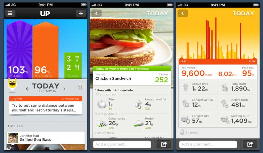
The Jawbone app is colourful, social and well executed. There are a couple of bits which are not immediately obvious (mostly around food), but it feels like a modern, well designed app with great attention to detail.

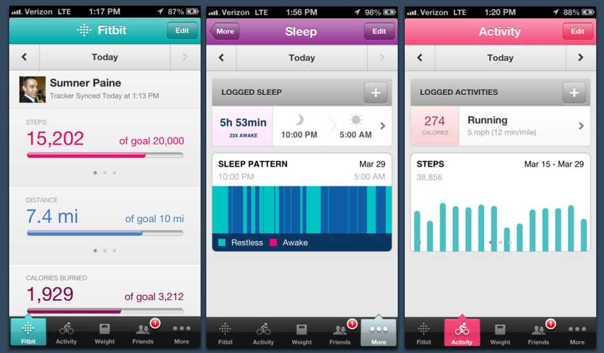
The Fitbit app is functional, but it feels half finished. If I added some food, and then deleted it and added something else, neither would show, then both would show. It felt a bit disorganised and lacking the level of polish I was expecting.
Bottom line, the app made or broke the hardware experience. Charlie Kindel has been talking about this for a while[2]: Apps, or hardware, on their own are dead. It's the whole experience that matters now, and the whole experience of the Flex was brought down by the quality of the app. For me, their hardware was better[3], but the hardware was not the thing I interacted with - it was the app and the backend services, and the Up did a much better job of that.
So, in the end, I returned the Flex, and got an Up. So far, I'm happy with it.
What are you doing to make your users experience better? Just focusing on one area? Ignoring something that looks like a nice-to-have that might be a deal breaker for a lot of your customers?