Android has long been the poor cousin from a design perspective. The older versions - ok, even the "most popular current version" (2.2) - looked dated, inconsistent and clunky against even the oldest iOS and Windows Phone 7 designs.
That's not the case any more. With Android 4.0 (ICS / JB), Google have come out with a full HIG-like design document, detailing all the standard interface controls, what they do, and how and where to use them properly. It does into a lot of detail about not just how, but also why you want to use certain controls or widgets in certain ways.
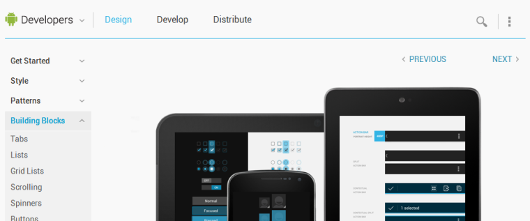
The result is quite brilliant. It's like the HIG, but with pictures. It's worth a read, even if you are only interested in iOS development: it's always good to get inspiration from what other are doing, even if it's just that: inspiration.
It appears Microsoft have a similar document for their now-renamed Metro (Windows 8 style? Modern style?) design language.