First up, I realise this is pointless, but it's been pissing me off for ages.
[Update: this is now in Apple's bug system as BugID: 10469092]
I have fairly large fingers. They are not huge, but they are not dainty lady-hipster-fingers, either. Most things in iOS - actually, everything in iOS except this - works great with my chubby digits.

The first one is the most minor. The controls at the top of the screen - where the slider is - is so closely spaced that it's nearly impossible to use the scrubber if it's near the genius button. You have to deliberately tap above the scrubber to hit it, which defeats the purpose. On the plus side, if you miss, it does nothing, rather than hitting the genius button. This doesn't piss me off too much, but mostly 'cos I don't use it that much.
The spacing of the prev/next/play/pause button at the bottom is ok in the screenshot, but if you have airplay speakers, they get bunched up a bit. Which leads me to....
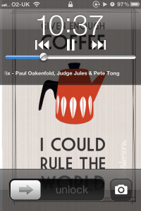
... the lock screen:
This is my main frustration, as I use this screen a lot (you get to it by double-tapping the home button when the phone is locked). The play/pause/next/previous buttons are very close together, making it too easy to hit the previous button when you want to pause.
If you are in the middle of a 2 hour podcast, you are now at the start. Sucks to be you. (or me, in this case).
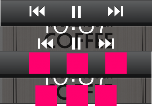
Again, if airplay speakers are detected on the network, that icon is added on the right, and everything shuffles over. In normal use, it's kinda hard to see, so here's a crop and merge of the two areas, with red showing the standard 44px x 44px button hit target.
The main problem I have is, there is space to fix this. There is a massive amount of space on the left and right of the next/prev buttons, so it's not like it's a lack-of-space issue. For me, this is the most un-Apple thing about the iPhone. The solution is easy, too: make it the same spacing as the Music app.
Job. Done.
I'm off to Radar (their bug system) to submit it - again - as a bug.

