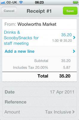
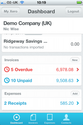
First, a little disclaimer and statement of potential bias. I develop MobileAgent, which is a native iOS client for FreeAgent, a SaaS accounting package we use for Big Ted. I am also a shareholder in Xero, and I know a lot of the people there, including the CEO, Rod Drury (who was also the CEO at AfterMail, where I worked in Wellington), the CTO, Craig Walker and a growing number of the people there.
Today, Xero released their new mobile version, Xero Touch I was pleased - sort of[1] - to see what Craig and co have done there. It has a nice set of mobile features (limited, but it is version 1, so I suspect more is coming), and a very slick UI. If I was a Xero user[2], I'd be all over it, and very happy to have it.


Craig, being a web guy (I think), has chosen to do it in HTML5 using Sencha Touch. The end result (quite possibly also thanks to Phil's design) is beautiful, and works the same on iOS as it does on Android (and I'd guess Windows Phone 7 when mango comes out). It keeps with the Xero colours and branding, while working nicely with the mobile screen size. Being a single source base, Xero can update it easily and quickly, so it'll keep in lock-step with their main product.
The issues I have are more around what is commonly called the Uncanny Valley:
The uncanny valley is a hypothesis regarding the field of robotics.[1] The hypothesis holds that when robots and other facsimiles of humans look and act almost like actual humans, it causes a response of revulsion among human observers. The "valley" in question is a dip in a proposed graph of the positivity of human reaction as a function of a robot's lifelikeness.
In using the Xero Mobile app, I find the same thing, tho to be honest, "revulsion" is a bit strong a statement in this case, because the app is visually and functionally brilliant.
The problem is, it looks and feels almost exactly like a native app, with emphases on almost. Except when it doesn't. Here's some examples:
-
The tab bar is on the bottom. This is fine for iPhones, but on the Android, the tabs are on the top, so Android users are going to feel a bit strange, or worse, fat-finger the back/home button when going for the tabs. (I tried it on a friend's Android phone, but I couldn't load the login page, so it may handle this)
-
The back buttons are buttons, without the usual arrow look of an iOS app. I assume it works with the Android back button.
-
The spinner is nice, but it goes a little too quick compared to the native one.
-
When I hit back / cancel, the screen comes in from the left, not the right, in some cases (Contacts and Expenses do this, Invoices doesn't) which makes it feel like I'm moving forward, not back. This also highlights one of the main benefits: Since I tweeted to Craig about this, he appears to have fixed invoices. The turn around time on webapps is how long it takes your deployment scripts to run. For a lot of cases, this is a seriously large positive point.
-
The scrolling - even with the bounce - isn't quite right.
-
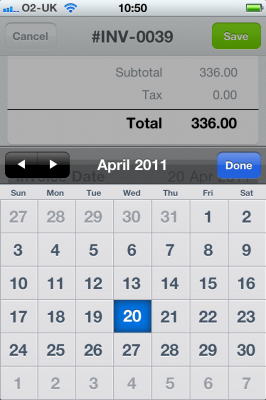
Some of the edit fields are very custom. This isn't really a big problem, but it's inconsistent with the rest of the OS (even if the date picker is so killer that I'm going to steal it for MobileAgent)

This is something which is an issue for all mobile web apps - and even things like Flash if it ever made it onto phones: it's a single interface being used across multiple devices, so the chances of it looking correct on any of those platforms is slim to none. It can still look good - and Xero Touch does look very good - but it doesn't look and feel like an iOS app. Or an Android app. This post on Hacker news, via Daring Fireball, is mostly right:
In my experience so far with such "cross platform compatibility layers," they always produce results that water down each platform's individual strengths and differentiations.
So in summary, bravo to Craig and co at Xero. Xero Touch is a nice web app, well executed, and I think it fits within their goals and constraints very, very well. It looks lush, to quote the Welsh. Sencha Touch (and jQuery Touch, I'd guess) goes a long way to bridging the gap between native and web apps, but like every other webapp-on-a-device, there is a still a way to go if they are going to get out of the valley.
[1] I'd had thoughts of doing mobileAgent for Xero, but never really had a personal need. I might still, as offline access isn't part of Xero Touch.
[2] I use FreeAgent because it fitted better with what we do at Big Ted. Both products have moved a fair bit since then, but I don't see a reason to move yet. If I start a new company (esp if it's not a consulting company) then we'll re-evaluate.